00:08:14
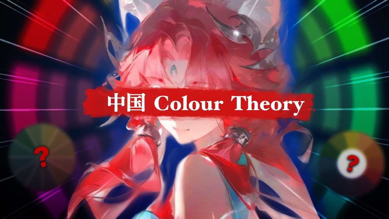
How Chinese Colour Theory Revolutionized My Artistic Approach
Traditional Western color theory, with its emphasis on complementary colors and analogous palettes, may not always serve artists seeking deeper emotional resonance. After studying approaches shared by Chinese artists on platforms like Bilibili (哔哩哔哩), I discovered fundamentally different principles that prioritize mood and storytelling over rigid hue relationships. This shift in perspective profoundly changed my art.
Beyond the Color Wheel: Shifting Focus from Hue to Mood
While Western artists often prioritize perfect hue matches, Chinese artists frequently emphasize capturing the energy or vibe of a subject. This concept, known as ti (体), focuses on how saturation and brightness convey emotion, rather than just the hue itself.
The practical application involves asking a crucial question first: What feeling do I want the viewer to experience? Colors are then selected based on their emotional weight:
- Calm & Serene Moods: Achieved through lower saturation and higher brightness (e.g., soft pastels). These combinations naturally soothe the viewer.
- Drama & Intensity: Created with high saturation and lower brightness. These colors command attention, likely because highly saturated hues are rare in nature and signal importance (e.g., ripe fruit, blood).
Saturation as Visual Hierarchy
Saturation isn't just about vibrancy; it dictates where the eye lands. The human eye is instinctively drawn to the most saturated point in any composition. An overly saturated element can disrupt an otherwise balanced scene.
Master artists use this strategically:
- They establish a foundation with calm, muted areas.
- They introduce one or two points of richer saturation precisely where they want the viewer's focus to rest.
This approach shifts the focus away from relying solely on complementary or analogous schemes for visual interest and towards using saturation to guide emotion and attention.
Sole Futai: Color for Storytelling and Authenticity
The deeper layer involves sole futai (设色), a principle that prioritizes emotional authenticity and narrative over rigid color rules. The direct translation falls short; it's about assigning color based on the subject's nature and the intended emotional atmosphere, not just visual balance or literal representation.
Consider painting a tranquil river scene. Instead of defaulting to textbook blues for water, a practitioner of sole futai might choose:
- Whites for the river.
- Softer, muted greens for the surroundings.
This creates an ethereal, airy feeling, enhancing immersion. It means moving beyond simplistic associations (tree = green, water = blue) to ask: What should the water *feel* like in this scene? The answer might lead to earthy grays for water or muted pinks and grays for skin tones.
The Power of Colored Grays
A critical insight challenges the notion of neutral gray. In reality, every gray is influenced by its context, taking on the qualities of surrounding light and color. The same gray can appear warm or cool depending on its environment.
Chinese artists often leverage this by using grays to represent specific colors within a harmonious scheme. Think muted lavender in shadows or softer peach in skin tones. This technique creates cohesion because the colors share underlying relationships.
Practical steps for applying colored grays:
- Think in Temperature: Ask "Is this area warm or cool?" before considering hue. Select a desaturated color matching that temperature.
- Mix Contextual Grays: Create grays using pigments already present in the scene. If the scene is warm, infuse warmth into shadows and backgrounds. This creates unity under a shared light source.
- Control Saturation: Use colored grays to provide visual resting places. Surrounding vivid areas with subtle grays makes the saturated spots feel richer and more impactful without increasing their brightness.
A Practical Exercise: Removing Color to See Emotion
To break free from literal color copying, try this exercise: Convert your reference image to black and white. Then, reimagine the colors entirely based on the emotion you wish to convey. Ask: What temperature fits this feeling? What saturation level supports it? This process shifts from mere description to expressive interpretation, embodying the essence of sole futai.
Adopting these principles from Chinese color theory – focusing on ti (mood through saturation and brightness), sole futai (color for emotion and narrative), and the nuanced use of contextual grays – offers a powerful alternative to traditional Western color rules. It encourages artists to use color as a primary tool for emotional storytelling and atmospheric creation.
 China's Mountain-Split Bridge: Engineering Triumph in Guizhou's Highlands
 Why China's Semiconductor Industry is Confidently Pushing Forward Without Nvidia Chips
 Mastering Social Media Marketing: Your Comprehensive Guide to Building Brands and Boosting Sales
 Sam Altman Unveils GPT-4's Breakthroughs and AGI Roadmap
 Cloudflare Outage Reveals Fragility of Modern Internet Infrastructure
 How Chinese Colour Theory Revolutionized My Artistic Approach
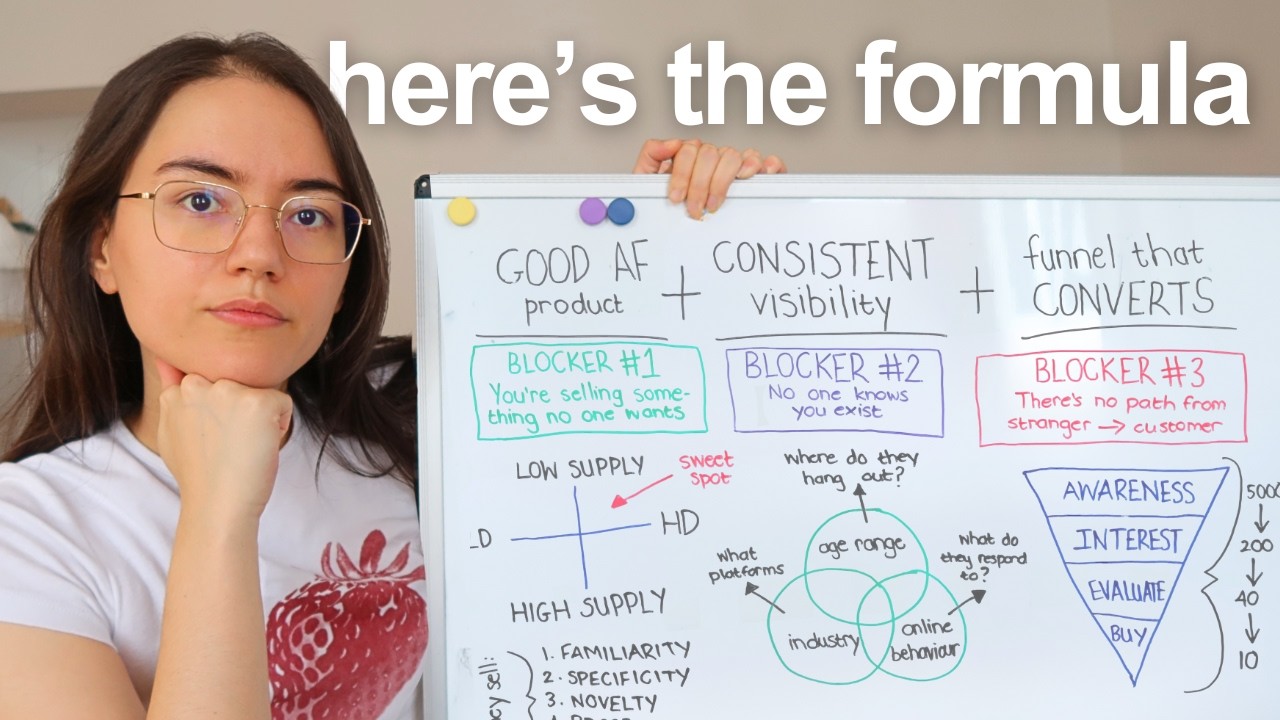
The $100K Business Formula: What Actually Matters
How Chinese Colour Theory Revolutionized My Artistic Approach
The $100K Business Formula: What Actually Matters
 David Heinemeier Hansson: Programming, Ruby on Rails, and Life Beyond Code
 Sam Altman Unveils GPT-5: Capabilities, Future of AI, and Societal Impact
 The Xiaomi SU7: A Glimpse of What We're Missing — And Why
 How to Win When AI Changes Everything: Key Insights from Sam Altman
 Does OpenAI's Sora Disrupt Meta? Analyzing the Shift in AI-Driven Content Creation
 Building a True MVP: How to Launch Fast and Validate Your Idea
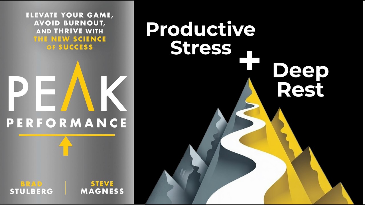
 Unlock Breakthrough Growth: The Peak Performance Equation Revealed
 Europe's Strategic Blind Spot: Why China Views the Continent as Invisible
 Is China Heading Toward a "Lost Decades" Scenario? Deflation, Property Crisis, and Consumer Gloom
 The Unconventional Genius Behind Linux: Linus Torvalds on Quiet Focus and Engineering Excellence
 Inside OpenAI's $500 Billion Stargate: The AI Megafactory Reshaping Tech and Society